Color offers an instantaneous method for conveying meaning and message in your Color Psychology in logo designs. It is the most powerful non-verbal form of communication we can use as designers. Our minds are programmed to respond to color. As humans, our survival is hung on the identification of color. We stop our cars for red lights and go on green, we look at the color of certain plants and animals to determine whether they are safe for us to eat or touch, the bottom line is that color is a very important part of our daily lives. It’s important for us as designers to use color appropriately and understand the meaning behind the colors we choose.
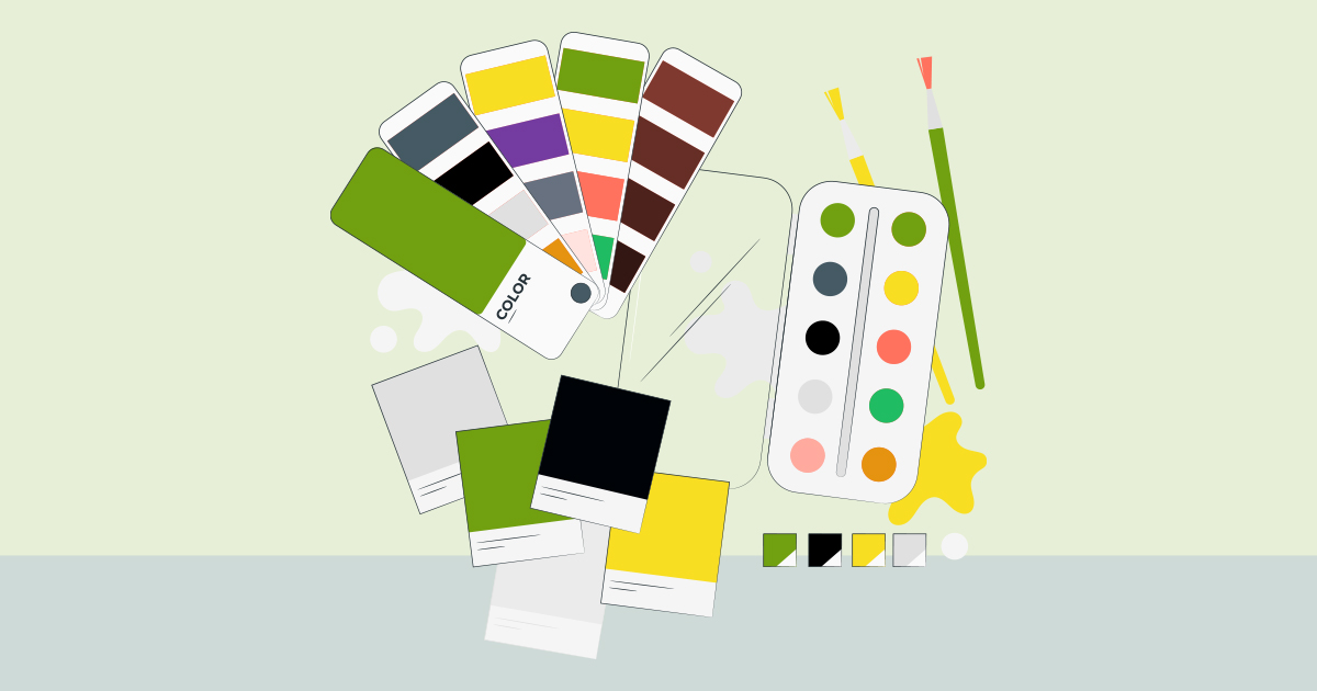
Color Psychology in Logo Design
RED
Red is an intense color. It creates conflicting emotions from blood and warfare to love and passion. It is often used in logo design to grip the viewer’s attention and has been known to raise one’s blood pressure or make people hungry.
PINK
Pink is a feminine color that conjures feelings of innocence and delicateness. It’s a softer version of red that can stir up visions of little girls, bubble gum and cotton candy. The color pink is also widely associated with breast cancer awareness. It is often used in logos to add a feminine flare.
ORANGE
Orange is made up of red and yellow and can represent attributes from each of those colors. It is less intense than red but still packs a lot of punch. It is more playful and youthful than red. You can commonly find it used in logos to create playfulness or stimulate emotions and even appetites.
YELLOW
Yellow, much like red, can have conflicting messages. It can represent sunshine and happiness or caution and cowardice. It is bright and highly visible that’s why it is often used in caution and other road signs. This is often used in logo design to get attention, create happiness and warmth.
GREEN
Green represents life and renewal. It is a restful and soothing color but can also represent jealousy and inexperience. You can often find it used in companies that want to portray themselves as eco-friendly.
BLUE
Blue is calming and can stir up images of authority, success, and security. Most people say that they like at least one shade of blue. It is probably the most popular color in logo design and can be seen extensively in government, medical and Fortune 500 company logos.
PURPLE
Purple implies royalty, mystery, spirituality and sophistication. Because purple is the combination of red and blue, it has both warm and cool properties. The color purple can be found in many education-related and luxury product logos.
BROWN
Brown indicates nature, woodiness, and utility. It is used in logos related to construction and legal logos due to its simplicity, warmth, and neutrality.
BLACK
Black is technically, the absence of all color. It’s powerful and conjures authority, boldness, elegance, and tradition. This can be found in many logos for their boldness, simplicity, and sophistication.
GREY
Grey, is somewhere between black and white. From a moral standpoint, it is the area between good and evil. It is also known as neutral and cool. It is often used for the type within logos because it is neutral and works well with most other colors.
WHITE
White is the universal color of peace and purity. It can often be found in logos as reversed text or negative space. As you can see these colors can be found in logos we know and recognize. Often the designer has considered the meaning of the colors when choosing the palette for the logo. Next time you’re designing a logo remember to ponder the meaning of the colors you choose and do so wisely. Just remember, color psychology consists of culturally created ties that can change over time and location.